I took the 43 058 tweets I wrote between 2008 and 2017, extracted all twitter handles and created a graph that shows how they are following each other today.
Overview
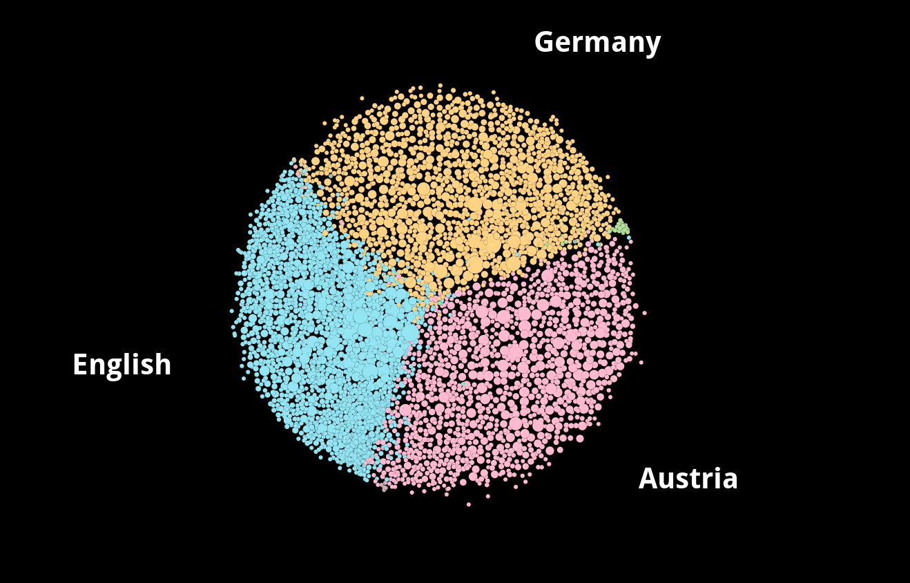
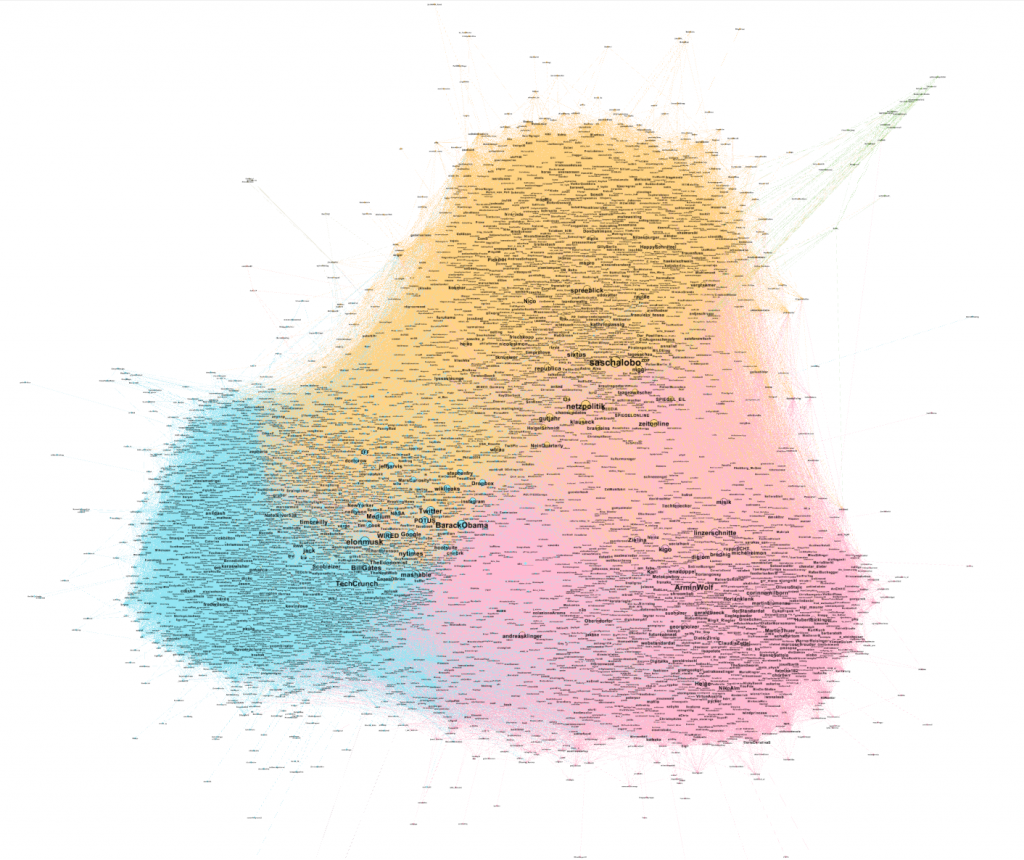
There are three pretty distinct clusters. In orange at the top is Germany (30%). In red at the bottom right is Austria (25%) and the blue one on the bottom left are English speaking accounts (44%), mostly from the USA.
Node size indicates the relevance inside the network, as in how many accounts from the people I interacted with over the years follow them.
Germany
I moved to Germany some years ago but interacted with many people from Germany before that. I used to say that SWAG (SWitzerland/Austria/Germany, thanks, Andreas) merges online because of the shared language. But all my visualizations scream something different. Even within Germany you often can see that spatial proximity is more important than topical proximity. But at least in this graph, I couldn’t pinpoint topics at specific areas but neither do I see regions.

The Glue
Do you see how Germany is stronger intertwined with the English sphere than with Austria? I see several startups that have many connections to both clusters. The science area on the left is well better connected to Germany and English as well. Always keep in mind that this is just my bubble, not the internet. The accounts I interact with. Again between Austria and English, there are several startups and people working in that area. @NeinQuarterly seems to be the biggest node in the middle of everything.
Austria
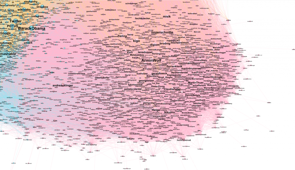
Bottom left of the Austrian sphere is full of startups. Some of them already nearer to the English cluster than to the Austrian. Furthest to the right is politics but media/journalists as well. There are various marketing agencies and people who work there, but I couldn’t say that there is a specific subcluster. Media researchers.
English
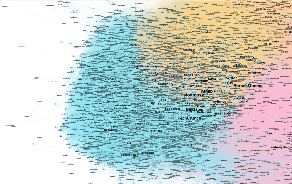
With 44% the most accounts, but most of them are small in this graph because they aren’t as connected to the rest of the accounts I interact with. Top left is science heavy, the bottom is startup heavy. The usual suspects with whom probably most Twitter users have interacted at some point. Twitter, BarackObama, Google, timoreilly, elonmusk, nytimes, techcrunch, mashable.
Statistics
I mentioned or retweeted 5 612 accounts. That doesn’t feel like much. There are 30 145 account handles in my tweets. But most of them are the same ones. On average I mention each account 5.4 times, but the median is at 1 time.

Let’s look at the 25 most mentioned accounts. Why is my own handle the most mentioned one? I looked at the tweets and found out that I really like to retweet tweets that mention me. I know most of those people from my time in Vienna. My wife is there. @workio was my first startup. @ambbase is a student tech blog I am writing for. @uarrr is an exception as I met him only once at a Barcamp in Hamburg but enjoy to tweet with him. Obviously. I have never met Kratochvil and he isn’t on twitter anymore.

How you can visualize your own network
- Requested and downloaded my Twitter archive. (Twitter API only gives you your last 3 200 tweets)
- Renamed the tweets.csv to luca.twt and used it as the source for twecoll: python twecoll init -q ‘luca’ && python twecoll fetch ‘luca’ && python twecoll edgelist ‘luca’ (see twecoll guide)
- Visualized it in Gephi. (see Gephi guide)


Leave a Reply