The tool is available here: https://accountanalysis.lucahammer.com/
I like Twitter and I like data. Over the last years, I published hundreds of Twitter analyses on Twitter. Often I get asked how I create them. I use the Python CLI tool twecoll to collect the data and a mix of Gephi, Excel and custom Python (Jupyter ❤) scripts to extend and analyse it. This makes it hard for most people to re-create my results. When people suggest I look at a specific keyword or account, I often have to decline and point at guides how to do it themselves or ask them to pay me to do the analysis.
The Account Analysis Tool helps people to analyze Twitter accounts themselves. Without the need to install anything or learn how the Twitter API works. Just open the tool in your browser (desktop works best), log in with your Twitter account (read-only oAuth) and enter the account you want to analyze.
The tool offers a variety of stats which I will explain below. You can click on nearly everything to cross-filter all other graphs.
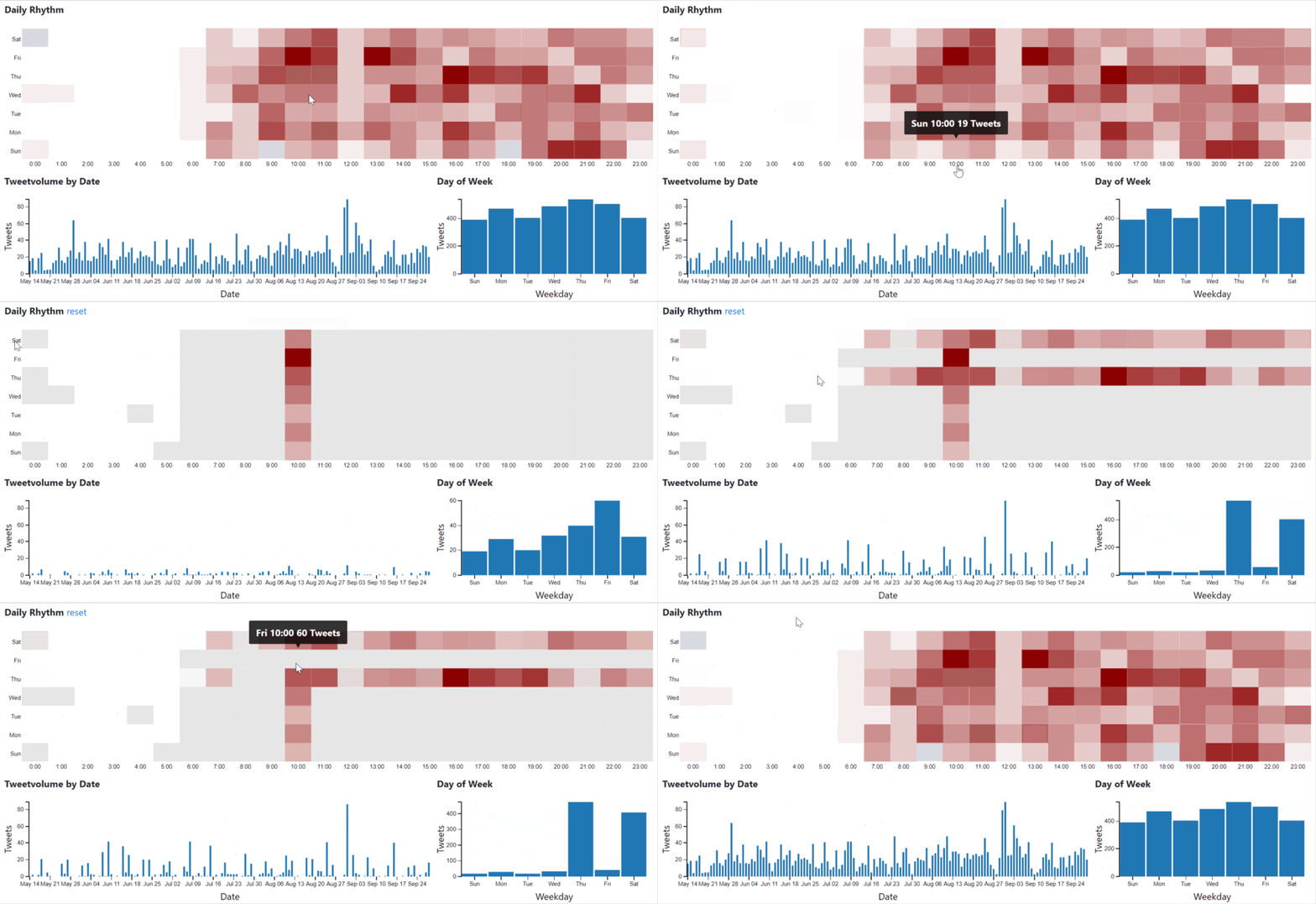
Daily Rhythm
The heat map shows at which hours on which weekdays an account is most active. The darker the red, the more tweets were published at that time. You can click on each individual hour or choose all hours of a weekday or the same hour each weekday. Or any combination. The times are shown for your local timezone.
The example below is my own account. You can clearly see that I get up at about 6am, have a break at 12pm and turn off my devices at midnight. You can explore my account on your own: https://accountanalysis.lucahammer.com/luca

For company accounts, you often see which times they have a communications planning meeting because there is a dark red square just after it. They get out of the meeting with fresh material to publish and the first one is sent immediately.
Sometimes a highly active hour is a red herring. Events as an example prompt more activity. You can spot them if you click on a dark square and see in the Tweetvolume chart that most Tweets happened on a single day. Look at the Tweets at the bottom of the page to confirm. Or look at the hashtags.
Tweetvolume and Day of Week should be self-explanatory. At the moment the tool loads the last 600 Tweets per account (exact count at the bottom of the charts). Depending on how active an account is, the results span over several months or just some days. If it less than a week, the Daily Rhythm chart obviously isn’t reliable.
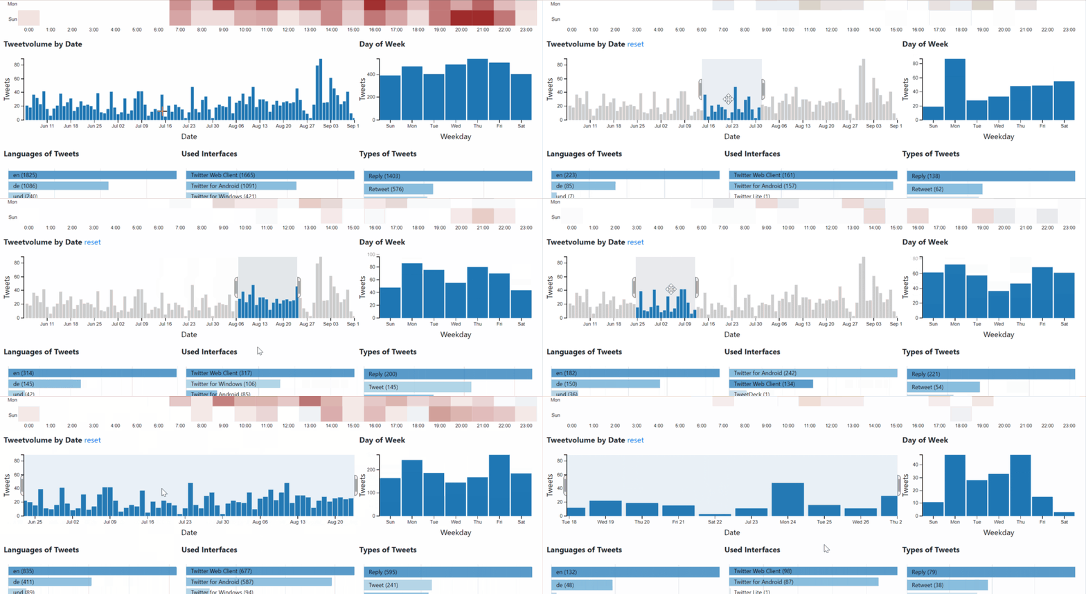
Specify a time frame
You can use the Tweetvolume chart to define which time frame you want to analyze. Simply click and hold to draw it. You can zoom through scrolling on it as well. There is still a bug where the reset-button doesn’t work properly. Use the Reset All at the bottom after zooming.

I use the time frame tool the most as it allows me to compare two time frames with each other.
Language, Interface, and Type
The next three charts could be pie charts because each of them adds up 100% and the categories are exclusive. The language of each Tweet is determined by Twitter. “und” means undefined and in most cases, it either means there aren’t enough words in the Tweet or the words are part of multiple languages. While it is normal to see a small number of Tweets in many languages because of misclassification, you should be suspicious if an account has many Tweets in many languages. It’s possible, they speak them all, but unlikely. Most Tweets of my account are in English, but there are many in German as well. But that’s it. The rest are undefined or wrongly attributed.

The next chart shows you which apps the account uses to publish Tweets. Retweets are a special case. While the language obliviously shows the original language, the interface doesn’t show the interface of the original Tweet, but the one that was used to retweet it. I will add such explanations in the future within the tool. You can see that I use the Twitter Web Client the most, but Twitter for Android and Windows as well. If you click on them, you will see that I switched for a month from Android to Windows. If you read the first Tweets I published on Windows, you know why.
While language and interface come from Twitter, the tool classifies the types itself. As far as I know, it is the first tool to show the usage of threads. A thread consists of a Tweet and one or more Self-Replies. 499 of my last 3 200 Tweets are self-replies, which shows a rather heavy use of threads. Retweets are only native Retweets. Quotes are Tweets with a link to a Tweet. Replies are Replies to someone else than yourself.
More stats
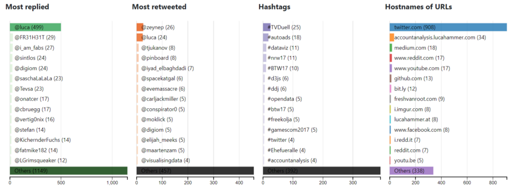
While in the charts above all Tweets were in all charts, the ones below don’t add up to a whole. Most replied obviously only counts withing Tweets of the type reply, most retweeted only within Retweets and Hashtags only in Tweets that have a hashtag, same for URLs.

The analysis doesn’t show all mentioned accounts, but only the account the reply is directed at. This was my decision because I think that the mentioned accounts are mostly meaningless. Twitter automatically mentions all accounts that were mentioned in the Tweet one replies to. Maybe I will add a chart with mentions within a Tweet.
While most replied and most retweeted ignore capitalization, Hashtags are case sensitive at the moment. I simply haven’t thought about a proper solution yet. Comparing which way of writing is used the most, seems like the best one, but that adds more computation than I believe is appropriate. Maybe I will just lowercase them all.
URLs are reduced to their hostnames. While my other tool expands some short URLs, I choose to not do it this time, because the usage of URL shorteners and which are used, is more interesting to me than the actual URLs.
Keep in mind that per default Hashtags and URLs contain those of Retweets as well.
Count and Tweets
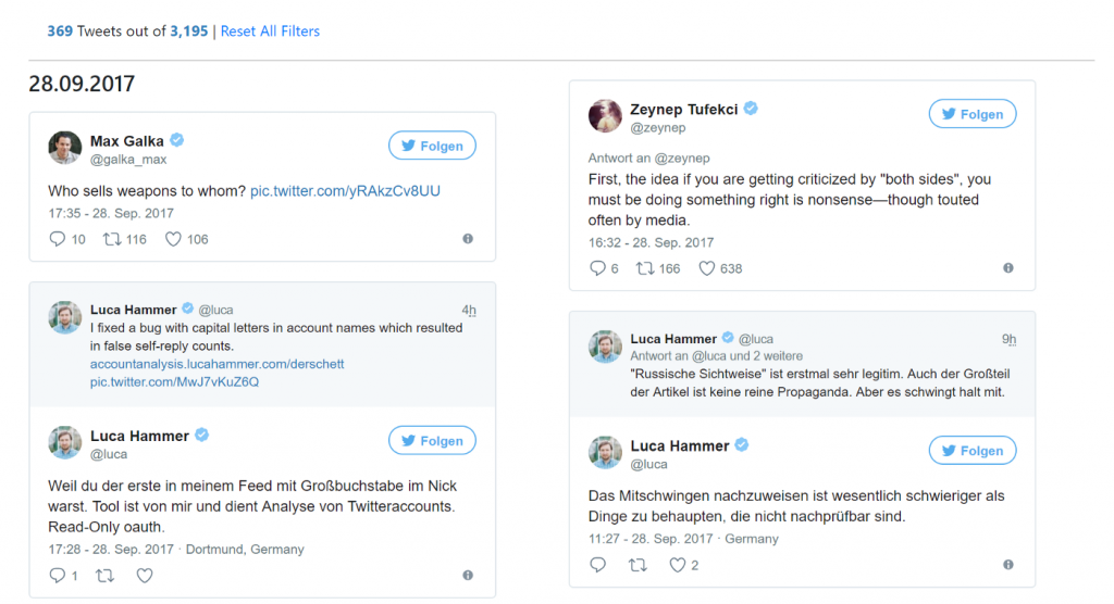
At the bottom of the page, you see how many Tweets the tool loaded and how many are in your selection at the moment. Below that the 10 most recent Tweets of the current selection are shown.
I believe the combination of stats and actual Tweets makes the tools so powerful. It is easy to drill down to specific Tweets to better understand an account. You see that an account links a lot to a specific domain and at the same time you can look at the actual tweets to see if they simply tweet the headline or if there is some commentary as well.

So many plans
I coded most of the tool on one weekend and invested some more hours since then to improve it. If you follow me on Twitter, you know that I have been thinking about creating something like this for years. One tool that inspired me is Tweetstats, which I first used in 2008.
While the tool works as it is, I have many ideas for it. The two biggest ones are more documentation within the tool, to make it easier to use and to properly open source it.
I would like to add more features to the tool. Favorite and Retweet charts, faves of the account, simple text analysis. Different chart types. Proper color schemes. Snapshot-sharing, so the analysis doesn’t need to be recalculated each time. And so on.
Another big idea is to duplicate most of the tool to use it for the analysis of keywords.
Instead of creating a tool that labels accounts, I wanted to enable people to analyze accounts themselves and come to their own conclusions.
Let me know what you think about it, what could be improved and what you like the most.


Leave a Reply