
Since 2008 I create network visualizations to better understand how communities work. In this article I take a look at how verified Twitter users are connected and who they are.
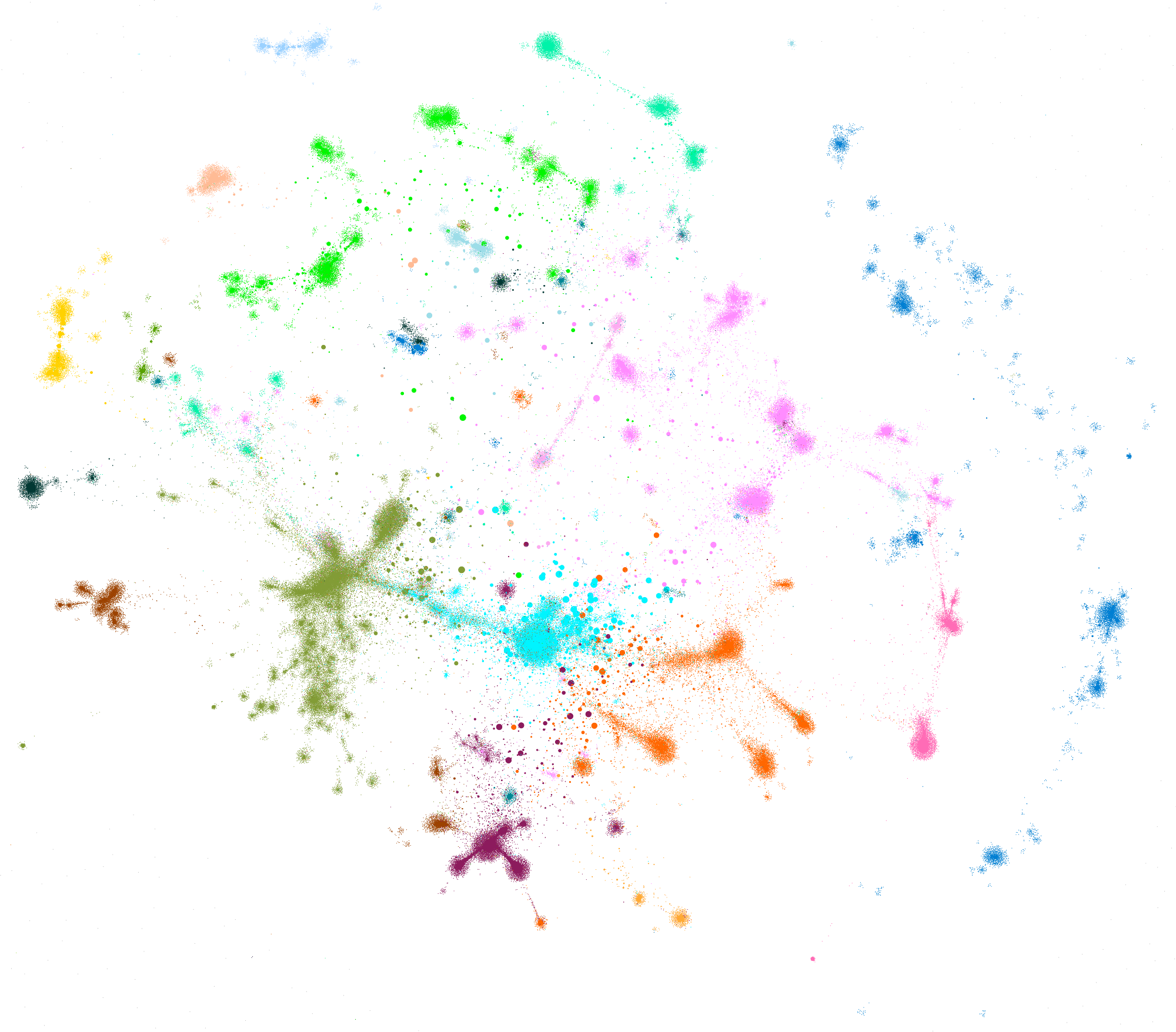
How are verified accounts connected on Twitter?
Here are all verified Twitter accounts in one image. Every node is an account and the size stems from how many people follow them. Size adjusted with spline interpolation to make accounts with fewer followers more visible and reduce the sizes of those with the most followers. Else the accounts with millions of followers would be bigger than many of the communities themselves.
Naming The Sub-Communities
The image looks nice, but it becomes interesting when you go deeper. Looking at each of these knots of accounts to understand what they are about. If they have something in common. Or if they are just random people following each other.

As you can see in the big image further below, the groups aren’t as disconnected as they look like without the connections (edges). But the algorithm was still able to find tightly knit communities. And while there are many cross communities followings, most followings happen among the communities itself.
The whole graph is US centric. That big brown node in the middle of everything. That’s @twitter. And the light blue one it’s overlapping with, that is @youtube. The other big light blue in the middle bottom right are celebrities. @katyperry, @justinbieber, @theellenshow, @rihanna, @ladygaga and so on. There is much more going on in this center sector but on this visualization it’s hard to see. I will take a closer look later in this article.
While it’s possible to differentiate between topical groups in the center, for the rest of the sub-communites they are mostly regionally grouped. This has to do with the smaller number of verified accounts for the other countries. If I put each of these groups on their own graph, I am sure it will be possible to get a clearer picture how they are connected in itself and not just one blob.
Germany, Austria and Switzerland are naturally connected by the language. Canada is the US extension to the left, UK to the right and Australia at the bottom right. Again, language as one factor for it. There is the cultural closeness as well. But this exists for more groups.
Another language group is Spanish in green at the top. Even after multiple attempts, I wasn’t able to find another connection between all the accounts grouped together there. They are from different South American countries as well as US media outlets in Spanish and more. Close to Mexico, Argentina, and Spain. Brazil with some distance.
Turkey is far away from everyone else. Especially the EU, which is right beside the UN and some UK politics. Nearer to the EU there is Israel. I was surprised that Portugal appears near Finland, Sweden and Denmark. On the other side Russia. And just behind Russia Qatar and Saudi Arabia.
France has an outsider position at the top right, some connection to Italy and Spain. Far away from the EU and Germany. But not all of Germany. There is another German sub-community. Soccer. Or better: Bundesliga. Bundesliga is close to the Netherlands as well. And of course to soccer in the UK. There is another group of sub-communities close: eSport. And eSport goes through twitch to game developers who sit at the edge of the US bubble.
At the right edge there is Asia with many several smaller communities. I still don’t know why Japan got two sub-communities which aren’t that well connected with each other.
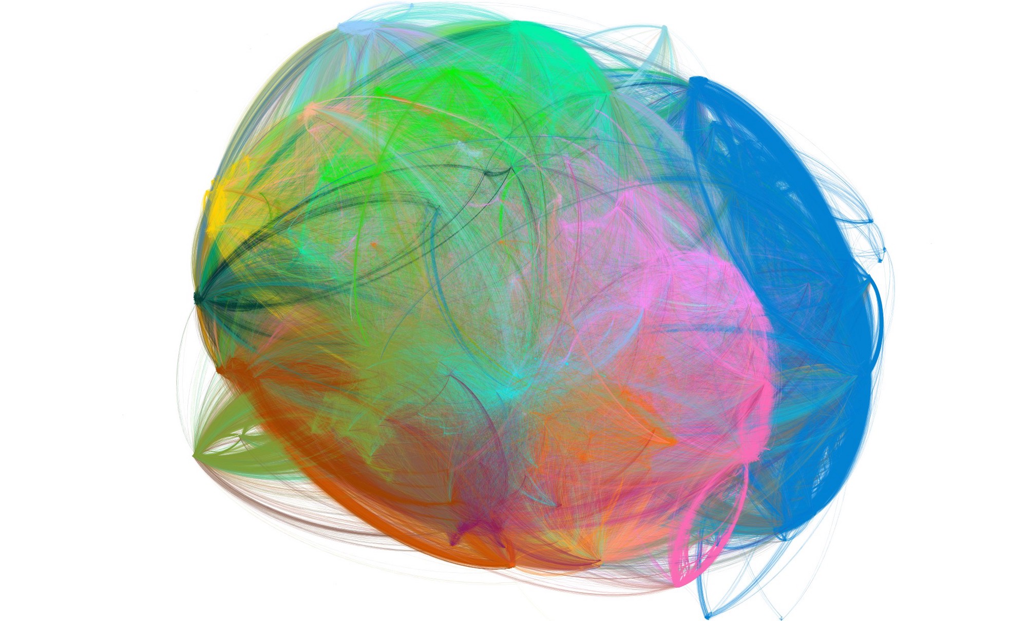
Journey Through The Graph [video, german]
In the video I go through the bigger sub-communities and talk about what I think they are and why they are displayed as a distinct group.
Most Popular Locations
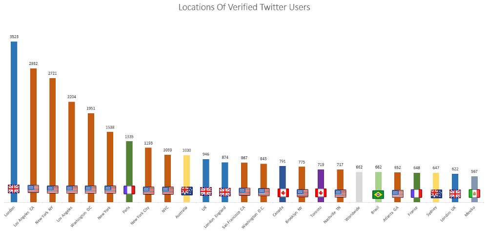
Twitter has no auto-complete for location data like Facebook does. People can put into the location field whatever they want. As a result it isn’t that great to work with the data. As you can see in the graph above in the Top 25 locations have several different spellings. London isn’t more popular than Los Angeles, but more people use the same form. And these are only the most popular forms, for each City there are many different ways to write them. Some add the state, some the country, some use the neighborhood and much more.
Maybe I will have time to look into all these forms one day or find a tool that normalizes them. For now I think the word cloud is enough because it doesn’t care about the exact location of the word in the string.

Collecting The Data
When my Twitter account became verified, I noticed that @verified started to follow me. Looking at its followings it’s easy to guess that it follows every verified account on Twitter. Therefore I can say there are 206 000 verified accounts on Twitter at the moment. And they verify circa 1000 accounts every day. There may be some accounts who block @verified and therefore don’t appear in their followings but I assume that the amount is so small that I can ignore it. Using the account as a starting point it’s possible to collect the network of verified accounts on Twitter.
I used a modified version of the Python command line tool twecoll by JP de Vooght to first collect a list of every account followed by @verified. The tool then went through all of these 205k accounts and looked whom they follow. For one data set I limited it to accounts who follow less than 10 000 accounts and a second data set for accounts who follow less than 1 000 accounts. There are two reasons for this. The more accounts people follow, the less important becomes each connection. The second reason is the technical limitation of my computer (i5 4670k at 4,2GHz, 16GB RAM, Samsung EVO 840 250GB, GTX 760). While it does work with the larger data set, it isn’t fun to work on, because everything takes longer.
The data collection ran on a Raspberry Pi 2 for 7 days from 22. to 28.08.2016 with only some hours pause because of errors I had to fix manually. Because of the long run time there are some inconsistencies in the data when people followed or unfollowed someone in that timeframe. On this scale it doesn’t make a difference. There are some accounts in the data set which aren’t verified anymore. I took a closer look at 36 accounts. These were all the accounts who lost their verified status in one day out of every verified accounts. Half of them deleted their account/got suspended, the other half went private and lost their verified status because of that.
The big data set, <10 000 followings, has 205 718 twitter accounts and 45 302 877 connections between them. The smaller data set, <1 000 followings, has 205 718 accounts as well and 19 176 260 connections.
I use Gephi to visualize the data. I tweeted the process of getting the data into a useful state. OpenOrd (25, 25, 25, 10, 15; cut 0,8; 500 iterations) gave me the most useful layout. Colors are calculated by modularity algorithm. I change the sizes of the nodes from time to time. If not noted they are followers.
Some General Stats
I loaded the stats of the 205k verified accounts into Excel and ignored the connections. These numbers don’t ignore any accounts, no matter how many accounts they follow.
When I submitted my account for verification, I was told on by some contacts that I don’t have enough followers. Indeed verified accounts have on average 117 845 followers. But there is quite a longtail. The median is at 9 370 followers. There are more than 100k accounts with less than 10 000 followers. And the rest doesn’t have that much more. The average gets skewed by mega accounts like @katyperry with 92.2m followers. There are 188 verified accounts with more than 10 million followers and 4 330 verified accounts with more than 1 million followers. There is one verified account with only two followers.
https://twitter.com/luca/status/770224045774217217
But how many accounts do verified accounts follow? On average they follow 2031 accounts. But again we got some mega followings. One account follows 3.6m accounts. The median is at a quite manageable 475 followings. Personally I feel like everything above 5 000 followings isn’t followed manually. Following everyone is an often used tactic to generate followings. So many people did it that Twitter introduced a limit that you can only follow a certain percentage accounts more than follow you (Base limit 5 000, daily limit 1 000). This resulted in a new follow-and-unfollow tactic. Accounts follow as many people as possible and unfollow everyone who doesn’t follow them back in x days. I digress. There are 3 551 accounts which follow nobody and 33 328 accounts which follow less than 100 others. One account returned a negative followings of -28. I assume that’s a bug with the Twitter database.
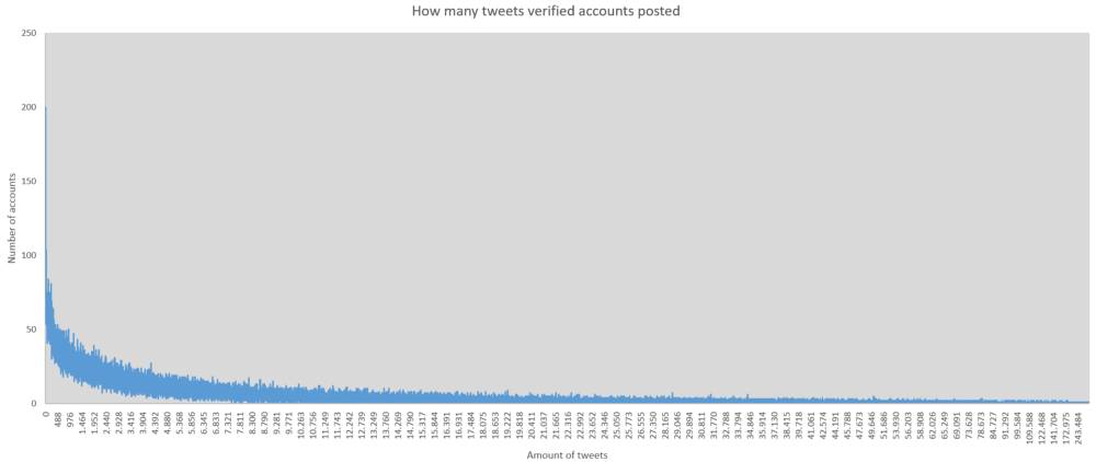
Verified accounts have posted an accumulated amount of 2 488 119 264 status updates. 12 095 on average. Median at 4 191. Without account age, these numbers mean nothing. Most talkative accounts are support accounts by companies. AmexOffers has posted 5.2m tweets. Of course there are many verified accounts which haven’t tweeted at all. Or deleted everything. 131 to give you the number. And 25 764 verified accounts posted less than 500 tweets.
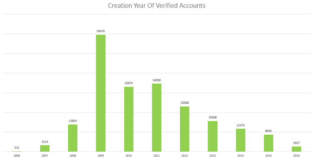
Most verified Twitter accounts were created in 2009. The graph above is quite unsurprising if you look at the general popularity of Twitter.
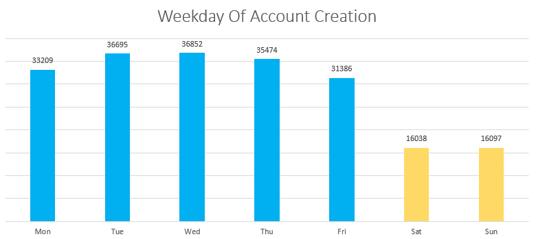
From Monday to Sunday nearly two times as many accounts were created than on the Weekend. I need a data set to compare it to before I can say if this is more likely to come from the general usage pattern of Twitter or if these accounts are more likely work accounts which are often created by agencies.
Seven Learnings
- Verified Accounts are regionally connected first, and thematically second
- Language is an important mutual feature
- The most followed accounts are the most popular celebrities
- Politics and Tech have more followers among verified accounts
- Media accounts are influential everywhere
- Most verified accounts are very active, but follow few people
- Sharing big graphs is complicated
Explore It Yourself And Tell Me What You Found
You can explore the graph either as a Gigapan version, which loads dynamically or you go all in and try the 30MB sigma.js version, which may crash your browser and takes some minutes to load, but has a search function. Or without search, but better zooming. Both sigma.js version have their y-axis inverted, what’s at the top in the screenshots here, is at the bottom there.
https://www.gigapan.com/gigapans/190922
Share your insights in the comments or via Twitter.
Collaborate With Me
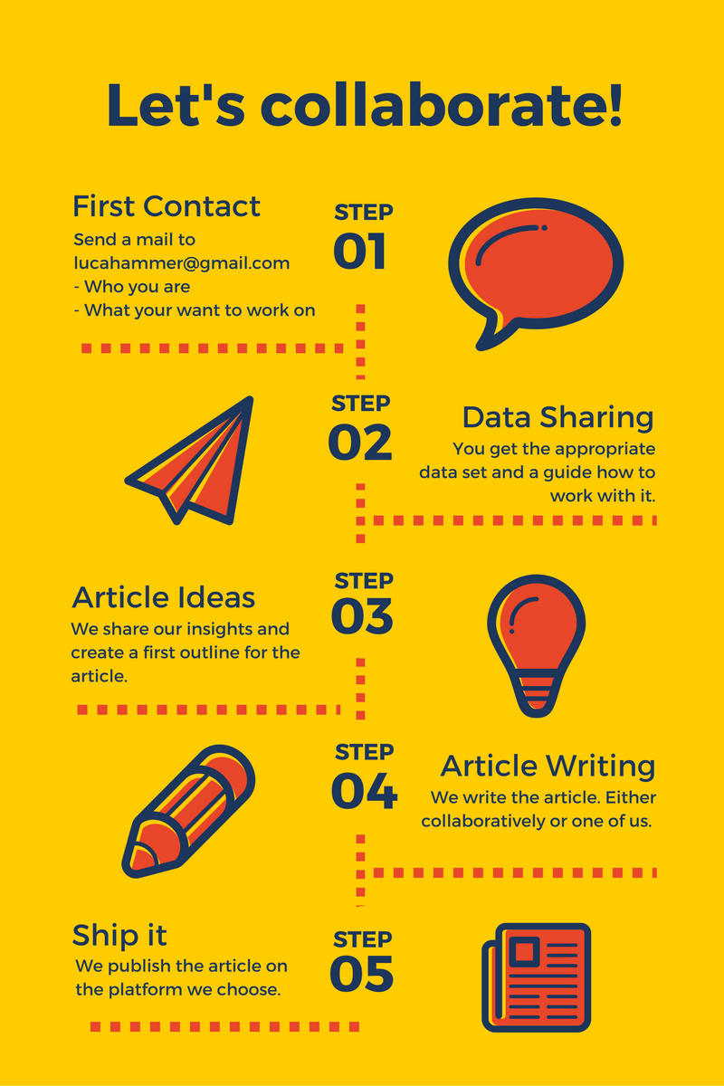
I want to write articles about each sub-communities and need help from people already knowing the respective group. If you want to collaborate with me on one of these articles please send me a mail with the group you are interested in: lucahammer@gmail.com. I will then send you a file with the data set for that group, a short guide how you can work with it and a Google Docs link where we can work on the article together. You can publish the final article on your own blog/medium/publication or we publish it here.
Leave a Reply